Chapter 1: Core
Now we will list almost everything [the remaining is in the advanced section] in the most API way. This will include:
Before we begin: Namespace
- popscript
- popscript_flags
- PopScript
- PS (alias of the above: PopScript)
- Pop
- pop
- popOut
- popClose
- popHide
- popToggle
- initiatePopScript
Components of a Pop
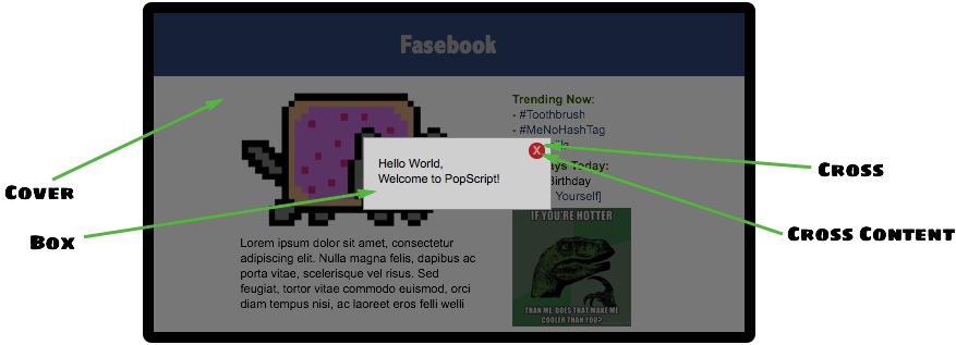
The above contains the 3 components of a pop: cover, box, cross. (cross content is not considered to be a primary component)
Pop Class
As mentioned in pop class section of Getting Started pop classes are very similar to CSS classes, to reiterate:
- Properties: Both pop classes and CSS classes have a property-value system. Though pop goes a level deeper, and provides scope nested properties, for example ‘CSS_CLASSES’, ‘ANIMATIONS’ > ‘IN’/’OUT’, and ‘POSITION’ scopes mentioned in the above code. However, the fundamental of property-value still remains a similarity.
- Inheritance: 2 or more CSS classes can be separated by spaces to form a chain of CSS classes which inherit from each other from the left to the right, in this format ‘<class 1> <class 2> <class 3> ... <class n>’. This exact same holds for classes in PopScript. For example here, ‘basic’ and ‘success’ can be merged together as ‘basic success’. And just as CSS class provide no explicit limit to the number of classes inheritable, pop classes offer the same too. Later on we will also see how similarly to inline CSS, we can also add inline PopScript :)
Syntax rules
A pop class can only contain alphanumerics and underscores, in terms of regex [A-Za-z_]`
The omnipresent pop class: “basic”
Now here is an important point: The class ‘basic’ would, (1) generally provide the skeleton of the pops you would like to create on your site, and/or (2) probably the very same class (just ‘basic’) you would use on multiple occasions just as it is. Therefore, PopScript prepends ‘basic’ to every single pop class you provide. Which means that if you input in pop class ‘success’, you are actually (behind the scenes) constructing a pop of class ‘basic success’. And if you give no pop class: ‘’, then that would simple evaluate to ‘basic’. Keep this part in mind before you begin poppin
Pop Properties
As mentioned in the previous subsection, pop classes are designed to replicate CSS classes in many ways. One of them is the notion of property-value. Now, to help you refer to pop properties, let us list below the entire default popscript (given at the top of the file popscript.js):
var popscript = {
    basic: {
        STYLE: {
            CLASS: {
                box: 'simple-box',
                cover: 'curtain',
                cross: 'cross'
            }
        },
        ANIMATION: {
            IN: {
                box: 'zap-in cubic-bezier(.73,.75,.72,1.77)',
                cover: 'fade-in',
                duration: 300
            },
            OUT: {
                box: 'zap-out cubic-bezier(.73,.75,.72,1.77)',
                cover: 'fade-out',
                duration: 200
            }
        },
        POSITION: {
            x: 'auto',
            y: 'auto'
        },

        cover: 'yes',
        cross: 'yes',
        cross_content: 'x',
        esc: 'ye',
        full_draggable: 'yes'
    },

    success: {
        STYLE: {
            CLASS: {
                box: 'success'
            }
        },
        ANIMATION: {
            IN: {
                box: 'drop'
            },
            OUT: {
                box: 'undrop'
            }
        },
        POSITION: {
            y: 'top'
        },

        cross: 'no',
        full_draggable: 'naaaaoh',
        click_me_out: 'yes, tis is convenient'
    },

    error: {
        STYLE: {
            CLASS: {
                box: 'error'
            }
        },
        ANIMATION: {
            IN: {
                box: 'short-arrive-left, fade-in'
            },
            OUT: {
                box: 'fade-out'
            }
        },
        POSITION: {
            x: '!10',
            y: '10'
        }
    },

    dropdown: {
        STYLE: {
            CLASS: {
                box: 'dropdown'
            }
        },
        ANIMATION: {
            IN: {
                duration: 90
            },
            OUT: {
                box: ''
            }
        },
        POSITION: {
            z: '-1'
        },

        cross: 'no',
        cover: 'no',
        full_draggable: 'no'
    },

    context_menu: {
        STYLE: {
            CLASS: {
                box: 'context-menu'
            }
        },
        ANIMATION: {
            IN: {
                box: ''
            },
            OUT: {
                box: 'fade-out',
                duration: 120
            }
        },
        POSITION: {
            fixed: 'no',
            z: '-1'
        },

        cover: 'no',
        cross: 'no',
        full_draggable: 'no'
    },

    tooltip: {
        STYLE: {
            CLASS: {
                box: 'popscript-tooltip'
            }
        },
        ANIMATION: {
            OUT: {
                box: 'fade-out'
            }
        },
        POSITION: {
            z: '-1'
        },

        click_me_out: 'yeh',
        cross: 'no',
        cover: 'no',
        blur: 'no',
        esc: 'yes',
        full_draggable: 'no'
    },

    tip_left: {
        STYLE: {
            CLASS: {
                box: 'popscript-tooltip left'
            }
        },
        ANIMATION: {
            IN: {
                box: 'short-arrive-left, fade-in'
            }
        }
    },
    tip_right: {
        STYLE: {
            CLASS: {
                box: 'popscript-tooltip right'
            }
        },
        ANIMATION: {
            IN: {
                box: 'short-arrive-right, fade-in'
            }
        }
    },
    tip_up: {
        STYLE: {
            CLASS: {
                box: 'popscript-tooltip up'
            }
        },
        ANIMATION: {
            IN: {
                box: 'short-arrive-up, fade-in'
            }
        }
    },
    tip_down: {
        STYLE: {
            CLASS: {
                box: 'popscript-tooltip down'
            }
        },
        ANIMATION: {
            IN: {
                box: 'short-arrive-down, fade-in'
            }
        }
    },

    roller: {
        STYLE: {
            CLASS: {
                box: 'roller'
            }
        },
        ANIMATION: {
            IN: {
                box: 'newspaper',
                duration: 800
            }
        },
        POSITION: {
            x: 'auto',
            y: '8%',
            roller: 'yes'
        }
    }
}
Before commencing on the properties, let us note the meaning of a PopScript boolean:
PopScript Boolean (poolean)
In most programming languages (including JavaScript) booleans are specified by the keywords true and false, and in the language of objective C, the keywords YES and NO are used. Now given that PopScript is a HTML5 library, and is implemented in JavaScript, the obvious choice of keywords would be the native ones true and false. These 2 keywords have been chosen, however it was decided to extend these keywords. Its done with PopScript booleans which are (obviously) either true or false:
- true
- Mentioned with JavaScript boolean true
- Mentioned with any String beginning with a “y” (case insensitive). Eg: "yup", "YESS", "yEaH buddy!"`
- false
- Mentioned with JavaScript boolean false
- Mentioned with any String beginning with a “n” (case insensitive). Eg: "NOOO", "no way!", "No, I said no"
Properties
Click on properties (in red) to view its role.
STYLE {
CLASS {
box:
| Input | String |
| Task | Accepts the CSS class(es) for the pop’s box. Single CSS class mentioned with the class name itself ‘<class>’. Multiple CSS classes separated by spaces as ‘<class1> <class2> ... <classN>’ (the order is maintained by PopScript). |
| Default | No class |
cover:
| Input | String |
| Task | Accepts the CSS class(es) for the pop’s cover (inclusion of this cover is optional, see the scope-less property cover:. Single CSS class mentioned with the class name itself ‘<class>’. Multiple CSS classes separated by spaces as ‘<class1> <class2> ... <classN>’ (the order is maintained by PopScript). |
| Default | No class |
cross:
| Input | String |
| Task | Accepts the CSS class(es) for the pop’s cross button (inclusion of this cross button is optional, see the scope-less property cross:). Single CSS class mentioned with the class name itself ‘<class>’. Multiple CSS classes separated by spaces as ‘<class1> <class2> ... <classN>’ (the order is maintained by PopScript). |
| Default | No class |
INLINE {
box:
| Input | String |
| Task | Accepts inline CSS for box. |
| Example | ‘background-color: gainsboro; padding:20px;’ |
| Default | None |
cover:
| Input | String |
| Task | Accepts inline CSS for cover. |
| Example | ‘background-color: rgba(0,0,0,0.5)’ |
| Default | None |
cross:
| Input | String |
| Task | Accepts inline CSS for cross. |
| Example | ‘border-radius:5px’ |
| Default | None |
ANIMATION {
IN {
box:
| Input | String |
| Task | Accepts the CSS animation for the entrance of the pop’s box. The input of the animation is of same format of that of the standard CSS3 animation property. There are multiple ways of entering a CSS3 animation inclusive of all animation subproperties such as keyframe name, delay, curving, duration and more. Refer to the w3 docs for further details. Remember that multiple animations can be specified with the delimiter of a comma.Please note that supplying a duration for the animation is optional in case you specify the duration property. And if no animation is desired then input the empty string ‘’. |
| Example | ‘zap-in 2s, fade-in’ (yes, no duration is mentioned for the second animation ‘fade-in’, please read on) |
| Default | ‘’ |
cover:
| Input | String |
| Task | Accepts the CSS animation for the entrance of the pop’s cover. The input of the animation is of same format of that of the standard CSS3 animation property. There are multiple ways of entering a CSS3 animation inclusive of all animation subproperties such as keyframe name, delay, curving, duration and more. Refer to the w3 docs for further details. Remember that multiple animations can be specified with the delimiter of a comma. Please note that supplying a duration for the animation is optional in case you specify the duration property. And if no animation is desired then input the empty string ‘’. |
| Example | ‘fade-in 1s’ |
| Default | ‘’ |
duration:
| Input | Number |
| Task | Accepts the (default) duration in milliseconds for the CSS3 (entrance) animations of the pop’s box and pop’s cover. In the case of a duration being explicitly mentioned in the CSS3 animation of the pop’s box or pop’s cover, that duration will be respected over this duration property. |
| Example | 250 (this is evaluated to 250 milliseconds) |
| Default | 300 |
OUT {
box:
| Input | String |
| Task | Accepts the CSS animation for the exit of the pop’s box. The input of the animation is of same format of that of the standard CSS3 animation property. There are multiple ways of entering a CSS3 animation inclusive of all animation subproperties such as keyframe name, delay, curving, duration and more. Refer to the w3 docs for further details. Remember that multiple animations can be specified with the delimiter of a comma. Please note that supplying a duration for the animation is optional in case you specify the duration property. And if no animation is desired then input the empty string ‘’. |
| Example | ‘zap-in 2s, fade-in’ (yes, no duration is mentioned for the second animation ‘fade-in’, please read on) |
| Default | ‘’ |
cover:
| Input | String |
| Task | Accepts the CSS animation for the exit of the pop’s cover. The input of the animation is of same format of that of the standard CSS3 animation property. There are multiple ways of entering a CSS3 animation inclusive of all animation subproperties such as keyframe name, delay, curving, duration and more. Refer to the w3 docs for further details. Remember that multiple animations can be specified with the delimiter of a comma. Please note that supplying a duration for the animation is optional in case you specify the duration property. And if no animation is desired then input the empty string ‘’. |
| Example | ‘fade-in 1s’ |
| Default | ‘’ |
duration:
| Input | Number |
| Task | Accepts the (default) duration in milliseconds for the CSS3 (exit) animations of the pop’s box and pop’s cover. In the case of a duration being explicitly mentioned in the CSS3 animation of the pop’s box or pop’s cover, that duration will be respected over this duration property. |
| Example | 250 (this is evaluated to 250 milliseconds) |
| Default | 300 |
POSITION {
x:
| Input | String/Number |
| Task | Accepts the horizontal positioning for the pop’s box. Broadly there are 3 types of inputs: (1) basic: only a numeric value is accepted, such as “400” (String) or 400 (Number), in this case (of “400”/400) the box will be positioned 400 pixels from the left of the page. If provided a number prefixed with ”!” then the position will be respected from the right of the page, in the case of ”!400”, the box will be positioned 400 pixels from the right of the page. (2) percent: a percent value is accepted, such as “20%”, in this case the box will be positioned 20% from the left of the page. Similar to the previous basic positioning, if a number prefixed with a ”!” then the position will be respected from the right of the screen, in the case of ”!20%”, the box will be positioned 20% from the right of the page. (3) macro: a predefined value is accepted which can be any of the 3 -> “auto”, “left”, or “right”. “auto” positions the box at the center of the screen, “left” positions the box to the left most of the screen (equivalent to 0 or “0” or “0%”), “right” positions the box to the right most of the screen (equivalent to ”!0” or ”!0%”). +scrolled or +scroll can be added to any of the aforementioned values, this will include the current amount of horizontal scroll to the given position. For instance if the value of “400 +scrolled” is given, and the user has scrolled 150 pixels to the right, creating a pop will be positioned at 400 +150 = 550 pixels from the left of the page. The difference between “+scrolled” and “+scroll” is that “+scrolled” is applied on a one-time basis, whereas “+scroll” is applied forever as it updates with further scrolling. In the current example of “400+scrolled”, if the user further scrolls 30 pixels to the right, with an overall scroll of (150+30) 180 pixels, the “400+scrolled” will strictly evaluate to the initial call where the scrolled amount was 150 pixels and therefore evaluates to 550 again, whereas “400+scroll” will respect the new scroll position of 180 pixels and evaluate to 580 pixels. |
| Example | 400 / “400” / ”!400” / “20%” / ”!20%” / “auto” / “left” / “right” / “40 +scrolled” / “40 +scroll” |
| Default | “auto” |
y:
| Input | String/Number |
| Task | Accepts the vertical positioning for the pop’s box. Broadly there are 3 types of inputs: (1) basic: only a numeric value is accepted, such as “400” (String) or 400 (Number), in this case (of “400”/400) the box will be positioned 400 pixels from the top of the page. If provided a number prefixed with ”!” then the position will be respected from the bottom of the page, in the case of ”!400”, the box will be positioned 400 pixels from the bottom of the page. (2) percent: a percent value is accepted, such as “20%”, in this case the box will be positioned 20% from the top of the page. Similar to the previous basic positioning, if a number prefixed with a ”!” then the position will be respected from the bottom of the screen, in the case of ”!20%”, the box will be positioned 20% from the bottom of the page. (3) macro: a predefined value is accepted which can be any of the 3 -> “auto”, “top”, or “bottom”. “auto” positions the box at the center of the screen, “top” positions the box to the top most of the screen (equivalent to 0 or “0” or “0%”), “bottom” positions the box to the bottom most of the screen (equivalent to ”!0” or ”!0%”). +scrolled or +scroll can be added to any of the aforementioned values, this will include the current amount of horizontal scroll to the given position. For instance if the value of “400 +scrolled” is given, and the user has scrolled 150 pixels to the bottom, creating a pop will be positioned at 400 +150 = 550 pixels from the top of the page. The difference between “+scrolled” and “+scroll” is that “+scrolled” is applied on a one-time basis, whereas “+scroll” is applied forever as it updates with further scrolling. In the current example of “400+scrolled”, if the user further scrolls 30 pixels to the bottom, with an overall scroll of (150+30) 180 pixels, the “400+scrolled” will strictly evaluate to the initial call where the scrolled amount was 150 pixels and therefore evaluates to 550 again, whereas “400+scroll” will respect the new scroll position of 180 pixels and evaluate to 580 pixels. |
| Example | 400 / “400” / “-400” / “20%” / “-20%” / “auto” / “top” / “bottom” / “40 +scrolled” / “40 +scroll” |
| Default | “auto” |
z:
| Input | String/Number |
| Task | Accepts the absolute/relative z-index for pop’s box and (optionally) cover. absolute: only a numeric value is accepted, such as “999” (String) or 999 (Number), in this case both the pop’s box and cover will obtain a z-index of 999. relative: a numeric value prepended with a unary operator is accepted here (regex: \s*(\+|\-)\s*(\d*)), example “+2” or “-5”. In the former case of “+2”, the z-index will evaluate to 2 greater than the base z-index Z (mentioned in PopScript Flags). In the latter case of “-5”, the z-index will evaluate to 5 lesser than the base z-index Z. This relative positioning has beneficial use cases in the event of multiple (fixed/absolute) elements being overlaid on the page, which includes other pops; however in any other case it can just easily be left out. |
| Example | “999” / 999 / “+2” / “-5” |
| Default | Base z-index Z (in PopScript Flags)` |
fixed:
| Input | PopScript Boolean (poolean) |
| Task | Accepts the choice of keeping the pop’s box fixed on the page. This is similar to CSS position fixed, and by default is turned on. However note that if roller is set to true, then this property is ignored. |
| Default | true |
roller:
| Input | PopScript Boolean (poolean) |
| Task | Accepts the choice of having a background fixed scrolling effect. You might be highly perplexed by the last sentence! Well its hard to explain in words. Check out the last example named ‘roller’ the demo page of this website. To see another example of such an implementation, check out the pop up Trello uses when you hit the ”?” keystroke on a Trello board. Note: please don’t let the name ‘roller’ confuse you here, its cause can be rooted to unimaginative issues of its creator. |
| Default | false |
x_scrolled:
| Input | PopScript Boolean (poolean) |
| Task | Setting this property to true is equivalent to specifying “+scrolled” for the x:. Its recommended that you specify it through x:. |
| Default | false |
y_scrolled:
| Input | PopScript Boolean (poolean) |
| Task | Setting this property to true is equivalent to specifying “+scrolled” for the y:. Its recommended that you specify it through y:. |
| Default | false |
x_scroll:
| Input | PopScript Boolean (poolean) |
| Task | Setting this property to true is equivalent to specifying “+scroll” for the x:. Its recommended that you specify it through x:. |
| Default | false |
y_scroll:
| Input | PopScript Boolean (poolean) |
| Task | Setting this property to true is equivalent to specifying “+scroll” for the y:. Its recommended that you specify it through y:. |
| Default | false |
check:
| Input | String |
| Task | Accepts the timeout and interval checking of the pop’s alignment. This is by far, the most complicated and advanced property you would deal with, leaving it to its default value is highly suggested, however for optimization reasons we provide you the ability to set it. Explanation: When a user scrolls on a page OR resizes the page, PopScript already has event handlers to deal with any position/alignment changes in real time. However, in the case of the box of your pop, abruptly changes its size due to: (1) An image included within the box loaded finally, blossoming to its true size (2) The developer dynamically modifies the DOM within the box. Due to lack of DOM4’s MutationObserver support, the only way to detect these size changes would involve polling every few seconds/milliseconds. This could be achieved with a simple setInterval(function(){//Check the alignment of every box and cover here}, 1) however performing a routine like that can be extremely resource intensive, and can potentially impact runtime performance. Explanation of this property: Given a string of syntax “<number1>, <number2>*, <number3>, <number4>, ... <numberN>(asterisk optional)”, this merely represents a list, with items of 2 types: (1) asterisk suffixed: For instance in the example given, <number2> is followed by an asterisk “*”, this signifies that every <number2> milliseconds a check on the position alignment of the given pop will be performed (the base: setInterval), (2) non-asterisk suffixed: The remaining numbers in the example are not followed by an immediate asterisk “*”, which translates to that after <number1>, <number3>, and <number4> milliseconds from the entry of the pop on the page, a check on the position alignment of the given pop will be performed. The current default value is “20, 333, 1000*”; which means that 20 ms and 333 ms after the pop has entered alignment checks will be performed, and every 1000 ms (1 second) an alignment check will be performed. As we warned you, this property is especially complicated. |
| Example | “100”, “200*”, “150, 800*” |
| Default | “20, 333, 1000*” |
out:
| Input | String (“close” | “hide”) |
| Task | Accepts the type of exit desired on the pop being exited by the user. There exist multiple possible ways of the user exiting a pop as you have seen so far: it could be that the user pressed the cross button, or hit the ‘esc’ key, or click on the cover overlay area behind the pop. Whichever it may be, broadly the pop has 2 possible destinies: (1) “close”: where its destroyed permanently from the DOM (2) “hide”: where its completely hidden from the display, however it exists in the DOM and can be re-popped (using the function popShow()). Therefore you have 2, and only 2 options here: “hide” or “close”. |
| Example | “close” / “hide” |
| Default | “close” |
click_me_out:
| Input | PopScript Boolean (poolean) |
| Task | Accepts the choice of enabling the user to click anywhere on the (box of) pop to exit the pop. |
| Default | false |
full_draggable:
| Input | PopScript Boolean (poolean) |
| Task | Accepts the choice of enabling the user to click anywhere on the (box of) pop to drag it around. Once the pop is dragged, its mentioned properties of x: and y: are overridden. (By default the cursor changes to a cursor:move value while the pop is dragged, if this is desired to be changed then edit the 3 lines CSS code specific to .popscript-drag at the top of the popscript.css file) |
| Default | false |
esc:
| Input | PopScript Boolean (poolean) |
| Task | Accepts the choice of enabling the user to escape a pop using the ‘esc’ keystroke. |
| Default | true |
blur:
| Input | PopScript Boolean (poolean) |
| Task | Accepts the choice of enabling the user to escape a pop by clicking (inclusive of right-clicks) anywhere on the page behind the pop. |
| Default | true |
cover:
| Input | PopScript Boolean (poolean) |
| Task | Accepts the choice of enabling a cover behind the box of the pop. The cover is essentially the (translucent/opaque) overlay behind the box of the pop. |
| Default | true |
cross:
| Input | PopScript Boolean (poolean) |
| Task | Accepts the choice of enabling the cross button on the box of the pop. Note that for in-depth customization one can simply disable this option of cross button, and create a custom node as described in the advanced section. |
| Default | true |
cross_content:
| Input | String |
| Task | Accepts the text content of the cross button. See cross content in Components of a Pop. |
| Example | “x” / “exit” / “dispatch” |
| Default | “x” |
destroy:
| Input | Number |
| Task | Accepts the number of milliseconds after which to out the pop. |
| Example | 300 |
| Default | disabled |
< Runtime Properties Below: >
beforePopIn:
| Input | Function |
| Task | Accepts a function to be called just before the pop is about to be created. If the return value of this callback function evaluates to false, the pop will not be created or redisplayed after being hidden. The function has one parameter: <new> (new is set to true when the pop has not been created before, and false when the pop is being redisplayed after being hidden). |
beforePopOut:
| Input | Function |
| Task | Accepts a function to be called when the user attempts to out (closed/hidden depending on the out: property) the pop. If the return value of this callback function evaluates to false, the pop will not be closed/hidden. This can be used to confirm with the user that they would like to close/hide the pop with “are you sure?” type messages. The function is provided with the parameters: <box node> , <out_type (this is based on the out: property)> |
afterPopOut:
| Input | Function / Array |
| Task | Accepts a function or an array of functions, to be called after the pop has been outted (closed/hidden depending on the out: property). The function is provided with the parameters: <pop ID> , <out_type (this is based on the out: property)> |
nearElement:
| Input | Array: [Node, Function] |
| Task | Accepts an array containing a DOM Node as the 1st element, and callback function as the 2nd element. The pop is positioned on the return value of the function provided, where the return value must be an array, the 1st element being the popscript x position and the second element being the popscript y position (this popscript position co-ordinates shall always be given priority over any previously mentioned popscript position co-ordinates). Now you may ask: Why did I provide a DOM node as the first element of this property? The answer lies in the function callback; the function has 4 parameters: <x (px) position of Node> , <y (px) position of Node> , <width (px) position of Node> , <height (px) position of Node> |
| Example | Check the “dropdown” example on the demo page |
Few Functions
Interpreting the function declarations require knowledge of the documentation technique explained here.
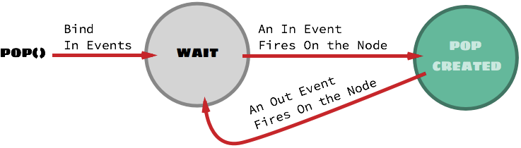
pop()
Without binder
parameter: content
Example:
pop( "Hello <b>World</b>" );
Example:
var info = document.createElement('div');
var header = document.createElement('h3');
header.innerText = "Your Account Balance";
var result = document.createElement('p');
result.innerText = "500 $";

info.appendChild(header);
info.appendChild(result);

pop( info );
Example:
pop (
    function (pop_id) {
        var info = document.createElement('div');
        var header = document.createElement('h3');
        header.innerText = "Your Account Balance";
        var result = document.createElement('p');
        result.innerText = "500 $";

        info.appendChild(header);
        info.appendChild(result);

        return info;
    }
);
parameter: pop_class
Example:
pop( "Your transaction was successful!", "success");
parameter: inline_popscript
Example:
pop( "You will be unable to close this pop by using the 'esc' key.", {esc: "no"} );
With binder
parameter: binder
- Node: This is a DOM Node. Example: document.getElementById('dropdown-button').
- Array / String: This is either, an Array of Strings or a single String. The String(s) here are events. Example: ["click", "mouseover"] / "focus". (These events are in events)
- Array / String: This is either, an Array of Strings or a single String. The String(s) here are events. Example: ["click", "mouseout"] / "blur". (These events are out events) [optional parameter]
- Bind all the in events (2nd parameter) to the Node (1st parameter).
- On the firing of any of the above attached events, deploy the pop with remaining parameters as to be done Without binder.
- If out events has been specified, attach all the out events to the Node; which on firing will cause pop to be outted.
- Attach all the in events to the Node; which on firing will cause the pop to be outted.
Example (taken from the demo page):
var dropdown_button = document.getElementById('demo-dropdown');
pop([dropdown_button, 'click', 'click'],
    '<ul><li>About</li><li>Help</li><li>Log Out</li></ul>', 'dropdown',
    { nearElement: [dropdown_button, function (x, y, w, h) {
        return [x, y + h + 4]
    }]}
);
popOut()
parameter: pop ID
parameter: out
popClose()
popHide()
PopScript Flags
The location is at top of the file, below the popscript:
var popscript_flags = {
    'alert error on error': false,  // alerts the error (alert)
    'throw error on error': true,   // throws the error (throw)
    'Z': 1000                       // base z-index for all pops
};
